

From Plain to Iconic: A Journey Through Napoli's Kit History
Imagine holding a 1920s shirt. Its heavy cotton feels rough and plain. Now picture a modern jersey. This fabric is light, breathable, and covered with sponsor logos. The contrast tells a remarkable story. How did a simple blue shirt become a global symbol? The evolution of napoli football kits shows football's commercial growth and cultural shifts. Each design change reflects the enduring identity of Naples itself. For ssc napoli, every jersey carries meaning beyond mere cloth. Fans see their city's passion woven into each thread. This visual journey explores how napoli moved from humble beginnings to worldwide fame. The path involves bold experiments, legendary players, and technological advances. Each era added new layers to the club's visual story.
Key Takeaways
-
Napoli's early plain blue shirts created a strong look that celebrated the city's working-class pride.
-
The Maradona era brought bold stripes and sponsors, turning the 1989 UEFA Cup shirt into a legendary icon.
-
The team changed its kit often in the 1990s. That matched the club's shaky play on the field and its weaker bond with supporters.
-
Modern kits mix old-school looks, like the Steed of the Sun, with high-tech fabric that helps players perform better.
Foundations of Blue: The Early Kit History (1920s-1970s)
The Azzurro Canvas and Humble Beginnings
SSC Napoli started, and the first players wore simple blue shirts with white shorts. These early outfits had no crests, no brand logos, and no ads. The thick cotton cloth showed the working-class spirit of Naples. Fans liked the plain look because it matched their own lives. The club picked azzurro blue to honor the sea around the city, and this choice created a lasting look.
The early years saw few design changes. Napoli football kits from this time only differed in small collar or sleeve details. The club's kit history stayed very steady during these years. While other Italian teams tried stripes or hoops, Napoli kept solid blue. This simple choice built a strong visual base. Fans could spot their team from far away without reading anything. The plainness became a point of pride, not a weakness.
Post-War Simplicity and the Rise of the Azzurri
World War II stopped football across Italy, but after the war came rebuilding and fresh energy. The azzurro color had heavy political meaning from before the war. Fascist Italy had used the blue shirt as a state symbol during the 1934 and 1938 World Cup wins. This link left an uneasy history that the post-war generation had to face.
The economic boom of the 1950s and 1960s changed what azzurro meant. As Italy rebuilt its cities and factories, the national team's shirt became a source of good pride. The home league grew stronger, and Italian clubs started winning European titles. This success helped shift the color's meaning away from its earlier political abuse. For ssc napoli, wearing azzurro tied the club to this larger national story of renewal.
Through the 1960s and 1970s, the simple tradition carried on without pause. No sponsors showed up on shirts during this time, and the designs stayed basic. The home kit had plain blue with white shorts and blue socks. This quiet period created a clean slate. When business chances finally came in the 1980s, the difference made the change even more striking. The deep history of these early years set up the visual style that later designers would respect and rework.
The Maradona Effect: Kits That Defined an Era (1980s)
The Arrival of Buitoni and a Bold New Look
The 1980s brought big changes to Italian football shirts. Companies started putting their names on jerseys, and the plain blue look from earlier years became a place for ads. Buitoni, a pasta brand, put its name across the chest of ssc napoli jerseys. This deal changed how the club looked. The sponsor's name appeared in white letters on the blue cloth, giving a neat and polished style. Fans were not sure at first about ads on their loved shirts, but the final look pleased them.
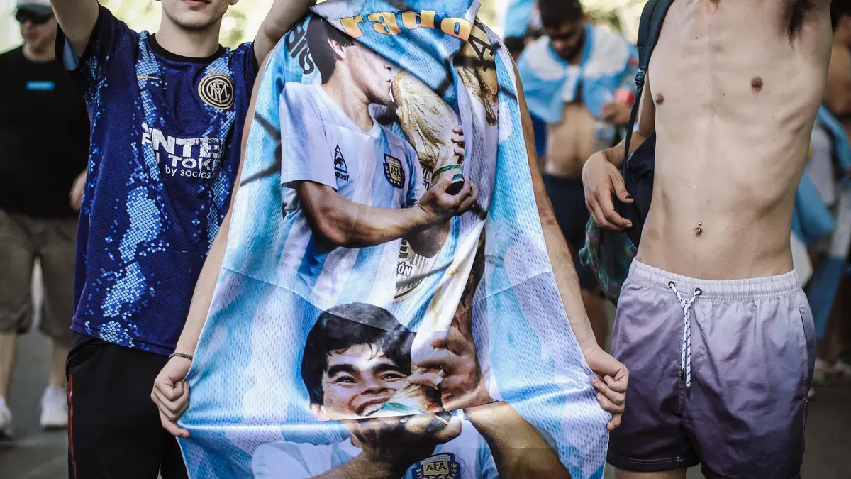
When Diego Maradona came to Napoli, everything shifted. The star from Argentina arrived with huge hopes, and his skill needed a shirt that matched his greatness. Napoli football kits from this time had bold designs that broke old habits. Wide white stripes showed up on some versions, making a strong contrast with the azzurro blue. Other shirts had classy collars that made players look sharp on the field. The stripes changed in size and position from season to season. Some shirts had one wide stripe down the middle, while others used several thinner lines. Each new style gave fans something different to enjoy.
The kit design in these years showed fresh confidence. The club no longer had to stay plain and quiet. Instead, ssc napoli chose bold looks that fit the rising energy around the team. The Buitoni logo sat clearly on the fabric, and fans wore these shirts with pride. The sponsor's name became part of the club's image rather than something unwanted. Local companies saw the benefit of linking with a winning team, and more sponsors joined later.
Maradona's talent made these shirts known around the world. TV shows displayed his amazing goals and dribbles, and viewers saw the special blue and white patterns. Supporters wanted to dress like their hero. Sales of copy shirts went up, and the bond between player and jersey grew stronger every match. Kids in Naples and elsewhere dreamed of wearing the same shirt as their idol.
The 1989 UEFA Cup: Cementing a Legendary Status
The UEFA Cup final gave the perfect stage for these famous shirts. Ssc napoli played VfB Stuttgart in two games, and the team wore their special blue tops with pride. Maradona led the squad with skill and drive, helping the club win its first big European trophy. The whole city of Naples stopped to watch the matches, and the streets filled with fans in blue.
The first game ended with a win for Napoli. The second game ended in a draw, which gave them the overall victory. Photos from that night show players celebrating in their bold shirts, and those images became part of football history. The look from that season stayed in the minds of fans forever. Maradona raised the trophy while wearing the famous blue shirt, and that picture appeared on posters and magazines all over Europe.
This win turned the 1980s shirts into special items. Fans who owned these jerseys kept them as reminders of a great time. The mix of Maradona's skill, the new sponsor branding, and the European success created a perfect moment. Napoli had made it on the big stage, and the world saw the club's unique style. The shirt from that season became the most wanted item for collectors.
The impact of these kits goes far beyond the 1980s. Modern designers still look back at the bold stripes and classic collars when making retro collections. The link to Maradona gives these shirts a deep feeling that few other football clothes can match. For the people of Naples, these patterns stand for pride, happiness, and a time when their city was at the center of the football world. Each new group of fans finds these classic styles and feels tied to that amazing period in the club's history.
Experimentation and Change: Napoli Kits in the 1990s
A Decade of Shifting Sponsors and Patterns
The 1990s brought chaos to the visual identity of ssc napoli. The decade started with promise. The team had won the Serie A title, and the future looked bright. But the departure of Diego Maradona changed everything. The club lost its superstar, and the shirts lost their stable look. Sponsor names changed almost every season. Voiello replaced Buitoni on the chest. Then came other brands like Record Cucine and Polenghi. Each new sponsor brought a different color scheme and logo placement. Fans never knew what the next season would bring.
The patterns on the shirts became wild and unpredictable. Some designs featured thin pinstripes running down the blue fabric. Others used geometric shapes or diagonal lines that cut across the chest. One season featured a large white collar that looked more like a polo shirt than a football jersey. Another design used a darker shade of blue that appeared almost navy on television screens. These choices showed a club searching for direction. The napoli football kits from this period lacked the bold confidence of the 1980s styles. Design teams seemed unsure about what the club should look like.
Reflecting On-Field Turmoil Through Design
The changing shirts mirrored the team's struggles on the pitch. Ssc napoli finished mid-table in many seasons during the 1990s. The club never came close to repeating the glory of the Maradona years. Financial problems started to appear, and the ownership changed hands several times. Each new owner wanted to leave a mark on the club's image. They changed the kit design as a way to show their authority. This constant shifting prevented any single look from becoming special.
The lack of a defining visual identity hurt the club's brand. Supporters found it hard to connect with shirts that changed so quickly. A fan who bought a jersey in one season could not wear it to match the team's look a few seasons later. The emotional bond between fans and their shirts weakened during this period. Napoli went through many different kit designs in the decade. This number stands in sharp contrast to the steady looks of the 1980s. The city of Naples still loved its team, but the visual chaos made the connection harder to maintain. The 1990s ended with ssc napoli facing relegation, a low point that matched the confusion in the club's wardrobe.
Modern Innovation and Nostalgia (2000s-2025)
Refining Tradition in the New Millennium
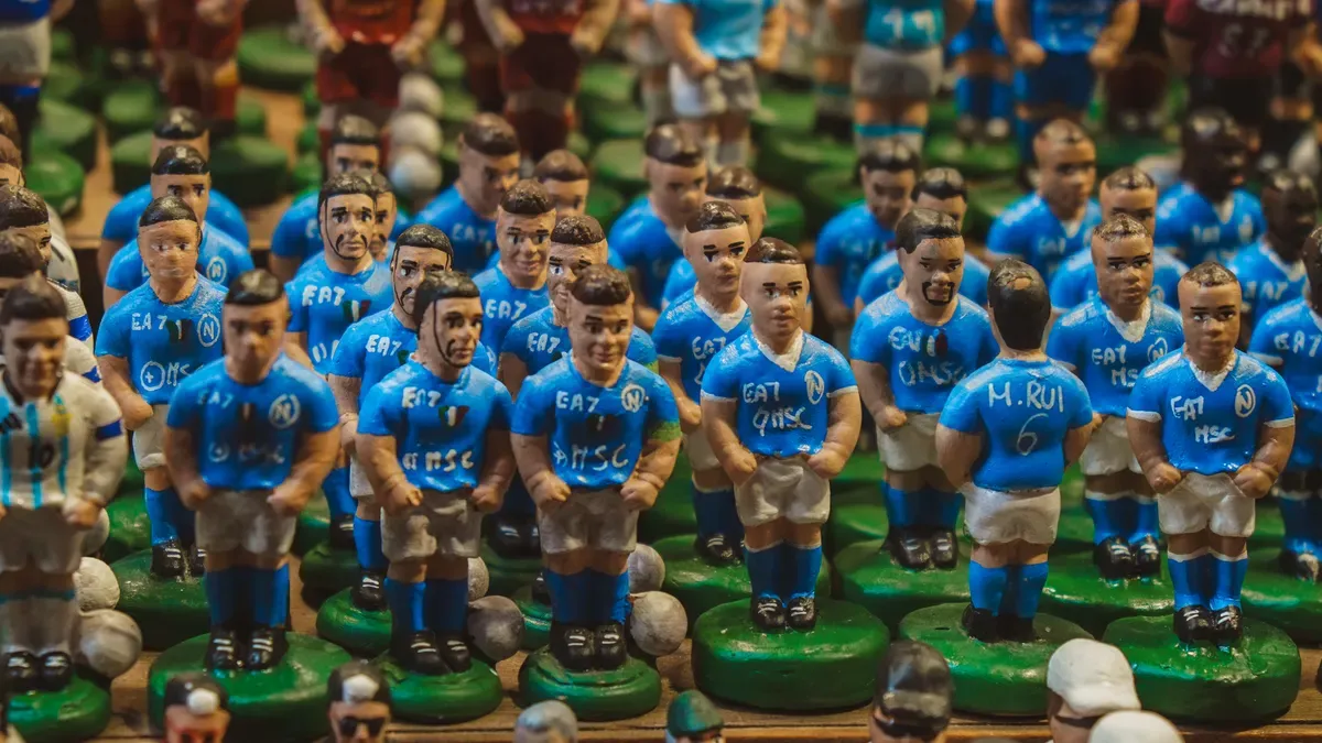
The new century gave ssc napoli a fresh start. The club returned to Serie A and slowly rebuilt its look. Kit designs went back to simpler and cleaner styles. The wild changes of the 1990s were replaced by refined blue shirts that honored the club's past. Napoli football kits from the early 2000s had small white trim and little collar details. The classic azzurro blue became the main focus again. Fans liked this return to tradition. Several manufacturers worked with the club during these years. Each used their own fabric technology. But the visual style stayed the same. Simple blue tops with white shorts became the standard look once more.
The biggest surprise came in 2013. An Italian manufacturer made a camouflage away shirt. The design broke every rule of normal football looks. Instead of the usual blue or white, the shirt used a military-style camo pattern. Many people wondered if fans would accept such a big change. The answer came fast. The shirt sold very well and became a surprise fan favorite. Supporters loved the bold choice and the unique look. The sales numbers showed that fans wanted creative designs as long as the quality was good. The camouflage pattern used shades of green and brown, a total break from the club's usual colors. Fans wore the shirt to matches and on the streets of Naples. The unusual design became a status symbol among supporters.
The camouflage design worked so well that ssc napoli took a rare step. The club replaced the shirt mid-season with an updated version that focused on the club's colors. The new edition kept the camo pattern but added more blue elements. The club believed the original design's success could help sales of the new version. This mid-season change showed the club's confidence in the pattern's popularity. The camouflage shirt's success opened doors for more experimental looks in later seasons. Other clubs noticed and started taking bigger risks with their away kits. For napoli, this gamble paid off in both sales and fan excitement.
The Centenary Era: Technology, Retro Revivals, and Global Fandom
The 2020s brought a new chapter for the team. The kit manufacturer brought modern fabric technology to the club's jersey. The new shirt used lighter materials that helped players stay cool during matches. Moisture-wicking fabrics replaced the heavy cotton of earlier times. The fit changed too. Modern shirts hugged the body tighter than the loose styles of the past. These advances helped players perform better on the field. The fabric also dried faster, keeping players comfortable through the full ninety minutes. The manufacturer's logo appeared in a small spot on the chest. The blue shade matched the original kit as closely as possible.
The home kits of this period looked back to the past while moving forward. The manufacturer studied the club's kit history and brought back classic features. The home kit of the 2020s had a retro collar that reminded fans of the Maradona era. The simple blue body with small white trim honored the founding years. Each season offered a slightly different take on the classic look. Designers balanced nostalgia with fresh details that kept the shirt interesting for collectors and casual fans alike.
The centenary season was the peak of this mix. The home kit brought back the 'Steed of the Sun' symbol from the club's early days. This original club crest had not appeared on a shirt for many decades. Its return connected the present team to the founding generation. The modern fabric technology kept the shirt comfortable and light. The manufacturer used advanced printing methods to place the historical crest on the fabric without adding weight or bulk. The result was a shirt that looked classic but performed like a modern sports garment. The symbol itself showed a horse facing the sun, representing the energy and passion of Naples. Fabric technology had advanced enough to reproduce the exact color from historical records.
The centenary shirt showed how far ssc napoli had traveled. From the plain cotton shirts of the 1920s to the tech-rich fabric of the 2020s, each era left its mark. The Steed of the Sun symbol reminded everyone of the club's humble start. The modern materials showed the club's commitment to progress. This blend of old and new captured the spirit of Naples itself. A city that honors its past while pushing toward the future.
The journey from simple cotton to modern high-tech materials reflects napoli's growth from a local team to a worldwide brand. Every jersey tells a story of business growth and cultural change. The kit is a canvas for the city's passion, pride, and strength through every era.
Ssc napoli's visual evolution never ends. Each new kit adds another chapter to this story. The club's identity grows richer with each design. Fans wear more than cloth; they wear history, hope, and belonging.
Which napoli kit is special to you? Tell us your favorite design, or look at the kit histories of other Italian clubs. Every shirt holds the city's spirit in its threads.
FAQ
What colors did Napoli wear in its first season?
The club first wore azzurro blue shirts with white shorts at its founding. This color honored the sea surrounding Naples. The early shirts had no crests or logos.
Why did the club change kits so often in the 1990s?
Ssc napoli experienced frequent kit changes during this period. Sponsor names shifted almost every season after Maradona left. New owners wanted to leave their mark on the club's look.
What made the UEFA Cup shirt legendary?
Diego Maradona wore that shirt while leading the team to its first European trophy. Photographs of the victory spread worldwide. Fans still link that design to the club's golden era.
What is the Steed of the Sun symbol?
The symbol shows a horse facing the sun. It appeared on the original crest for napoli. The kit manufacturer brought it back for the centenary kit after many years.
Why did the 2013 camouflage kit become popular?
The bold design broke all traditional rules. Fans loved the unique look. Sales proved that supporters appreciated creative choices when quality remained high. The kit became a surprise favorite.